Bigger is not always better. Sometimes a minimalistic approach, done with skill can provide interesting, if not fantastic results. Such as it is with Scorn, the debut game from small Siberian based developer Ebb Software. It’s scope is small, its approach minimal, and it works - for the most part.
To say that Scorn lets you discover things on your own is an understatement. When you start the game you are treated to a cutscene, then left to your own devices, having to figure everything out as you go. Seriously, it's so minimal that if you hadn’t played a single first person game before you wouldn’t even get how to move around. This is both an asset and the game's major problem, which I will get to in a bit.
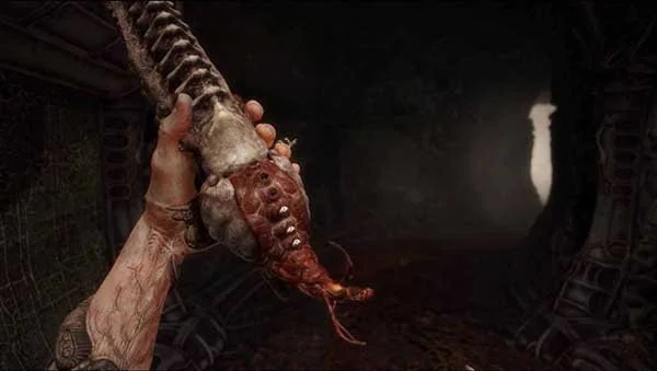
That opening cutscene sets up the look and feel of Scorn and it makes quite an impression. If you have ever looked up the art work of one H.R.Giger, yes that H.R. Giger, then everything will at once seem familiar but so vastly alien at the same time. There is no voice acting, no diaries to pick up, the entire game is metaphor layered on metaphor with that biomechanical art running through every inch of its world.
The biomechanical feel is really nailed, though it never makes the game world feel oppressive, just alien if that makes any sense at all. Operating switches and doors involves slotting your fingers into what can only be described as orifices and pulling down on muscle fibres. Any upgrades involve large needles being stabbed into your characters arms followed by squeals of pain. The look and feel they are going for is nailed at every turn, even in the weapons.
Those weapons are given to you after a surprisingly long time and an encounter with a very disgusting looking creature. Seriously, if you are very susceptible to nightmare fuel, maybe leave this one. Once you have it you get variations, though they are basically shotgun and really big shotgun and this is where the game truly falls from any grace it might have built up.
That minimalistic nature works in the context of Scorn being a puzzle game. Unfortunately, Scorn is not a full puzzle game and the combat is just dire. The lack of UI means that you have no idea how to heal yourself, that you have to reload the weapons, even that you have picked up any ammo for said weapons. Literally I ran around for forty five minutes trying to find ammo for the first weapon upgrade only to realize, by going into the settings menu for something else, that there was a reload button and a machine I had encountered ages ago is actually an ammo vendor.
This was the same for healing, the game never tells you can heal and the thing that shows you how much healing you have doesn’t even look properly like a heart due to the nature of the art style. I spent ages getting one shotted by enemies I couldn’t win against because the game simply never explained there was a healing mechanic and again, going into the settings out of frustration showing a heal button. Players shouldn’t have to go into the settings to figure out how to play your game on such a basic level.
It’s a shame because it brings down a genuinely interesting and arresting game from being one of the most unique in years to an annoying slog with combat rules that sometimes just don’t seem to make sense. The only saving grace is the actually pretty excellent final ‘boss’ encounter. I put boss in inverted commas because it's the best way to describe the fight, in a longer game it would simply be an escalation of the enemies. It does rule though, making good use of the space and things in the environment and requiring patience above all else.
Scorn is a very cool looking game that absolutely nails the look and feel it is going for. Unfortunately the combat just doesn’t work well enough and a minimalistic approach to UI really does nothing to help. Just a couple of tool tips and that would solve a lot of the problem, but alas they are nowhere to be found. If you want something unique to look at, then give it a go, just make sure you look at the setting menu first.


